
A well-designed room tells a story through its materials, textures, and tones. Every piece of furniture either adds to that story or interrupts it. That is why choosing the color of a large, sculptural wellness piece deserves as much thought as choosing a sofa, a rug, or a statement light. The right shade can make the piece feel like it was always meant to be there. The wrong one can make even a beautiful room feel unbalanced.
This guide walks through how colour works in high-end interiors and which shades pair best with different design styles, so you can choose with confidence.
Why Colour Matters More Than You Think
A massage chair is one of the bulkiest items you can bring into a living room, bedroom, or home study. Its size means its colour will dominate the visual field. Before picking a shade, it helps to understand three things:
- Visual weight: Dark colours look heavier and more grounded, while light colours appear to take up less space.
- Contrast: A chair can blend into the room, or it can act as a deliberate focal point.
- Material and finish: The same colour looks very different in matte leather, soft-touch synthetic leather, or textured fabric. Sheen changes how light is reflected and how rich the colour feels.
A luxury massage chair is typically designed with premium upholstery, tailored stitching, and a considered silhouette. Choosing a colour that respects those details helps the chair read as a design object rather than a piece of equipment.
Classic Neutrals: Black, Charcoal, and Espresso
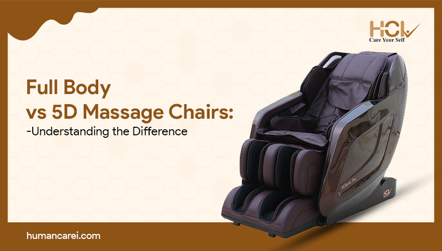
Dark neutrals are the safest route to an elegant look. Black and charcoal suit modern, minimalist, and monochrome interiors. They pair well with marble, brushed metal, smoked glass, and dark wood.
Espresso and deep chocolate brown work especially well in rooms with warm wood panelling, leather seating, or traditional study layouts. These shades hide everyday wear and bring a sense of quiet authority to the room.
Best for: Home libraries, studies, media rooms, and contemporary apartments with strong architectural lines.
Tip: In a very dark room, add a lighter cushion or a warm lamp nearby so the chair does not disappear into the background.
Warm Beige, Cream and Ivory
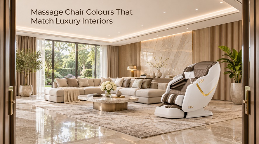
Soft, light tones create a calm, airy feel and suit rooms that rely on natural light. Cream and ivory work beautifully with limestone floors, linen curtains, pale oak, and gold or brass accents. They are a favorite in Scandinavian-inspired and “quiet luxury” interiors, where the richness comes from texture rather than contrast.
Because light colours show marks more easily, they work best with a durable, wipe-clean upholstery and in homes where the chair sits in a lower-traffic space.
Best for: Master bedrooms, spa-like bathrooms adjoining a lounge, and bright living rooms.
Rich Browns and Camel
Camel, tan, and cognac shades are timeless in high-end design, largely because they echo the colour of classic leather furniture. They bring warmth and a lived-in elegance and sit comfortably beside walnut, teak, brass lighting, and woven textures.
These tones also work well in transitional homes that blend traditional and modern pieces, since they feel familiar without looking dated.
Best for: Family lounges, open-plan living areas, and rooms with warm lighting.
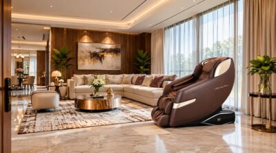
Grey: Flexible and Understated
Mid-grey and stone tones are among the most adaptable choices. They sit well between warm and cool palettes, so they rarely clash with existing furniture. Light grey suits airy, modern rooms, while darker slate adds depth in more dramatic spaces.
Grey is also a smart option if you expect to redecorate in the future, because it adapts to new wall colours and accessories with little effort.
Best for: Apartments, rented homes, and anyone who changes their decor regularly.
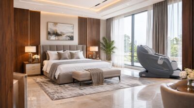
Bold Accents: Navy, Emerald and Burgundy
If your interior already leans toward drama, a jewel tone can turn the chair into a deliberate centerpiece. Deep navy pairs with brass and cream. Emerald green works with velvet, dark wood, and gold. Burgundy complements rich rugs, antique furniture, and candlelit settings.
These colours work best when repeated elsewhere in the room, for example, in a cushion, a piece of art, or a curtain, so the chair feels intentional and not isolated.
Best for: Boutique-style interiors, private lounges, and rooms where personality matters more than neutrality.
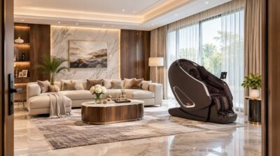
Matching Colour to Interior Style
Interior style | Recommended colours | Pairs well with |
Modern minimalist | Black, charcoal, light grey | Glass, steel, concrete |
Quiet luxury | Cream, ivory, taupe | Linen, limestone, pale oak |
Classic or traditional | Espresso, cognac, burgundy | Walnut, leather, brass |
Contemporary glam | Navy, emerald, black | Marble, gold, velvet |
| Scandinavian | Light grey, beige, stone | Birch, wool, white walls |
Practical Tips Before You Choose
- Test colours in your own light. Daylight, warm bulbs, and cool LEDs can all change how a shade looks. Ask for fabric or leather samples and view them at different times of day.
- Match undertones. Warm undertones (yellow, red) sit best with warm woods and gold. Cool undertones (blue, grey) suit chrome, glass, and stone.
- Consider the finish. A matte surface reads as relaxed and modern, while a subtle sheen feels more formal.
- Think about maintenance. Lighter shades need more regular cleaning, particularly in homes with children or pets.
- Plan the footprint. A full body massage chair needs space to recline, so consider how the colour looks both upright and fully extended.
- Repeat one colour. Echoing the chair’s shade in a cushion, vase, or artwork helps tie it into the room.
Placement Matters Too
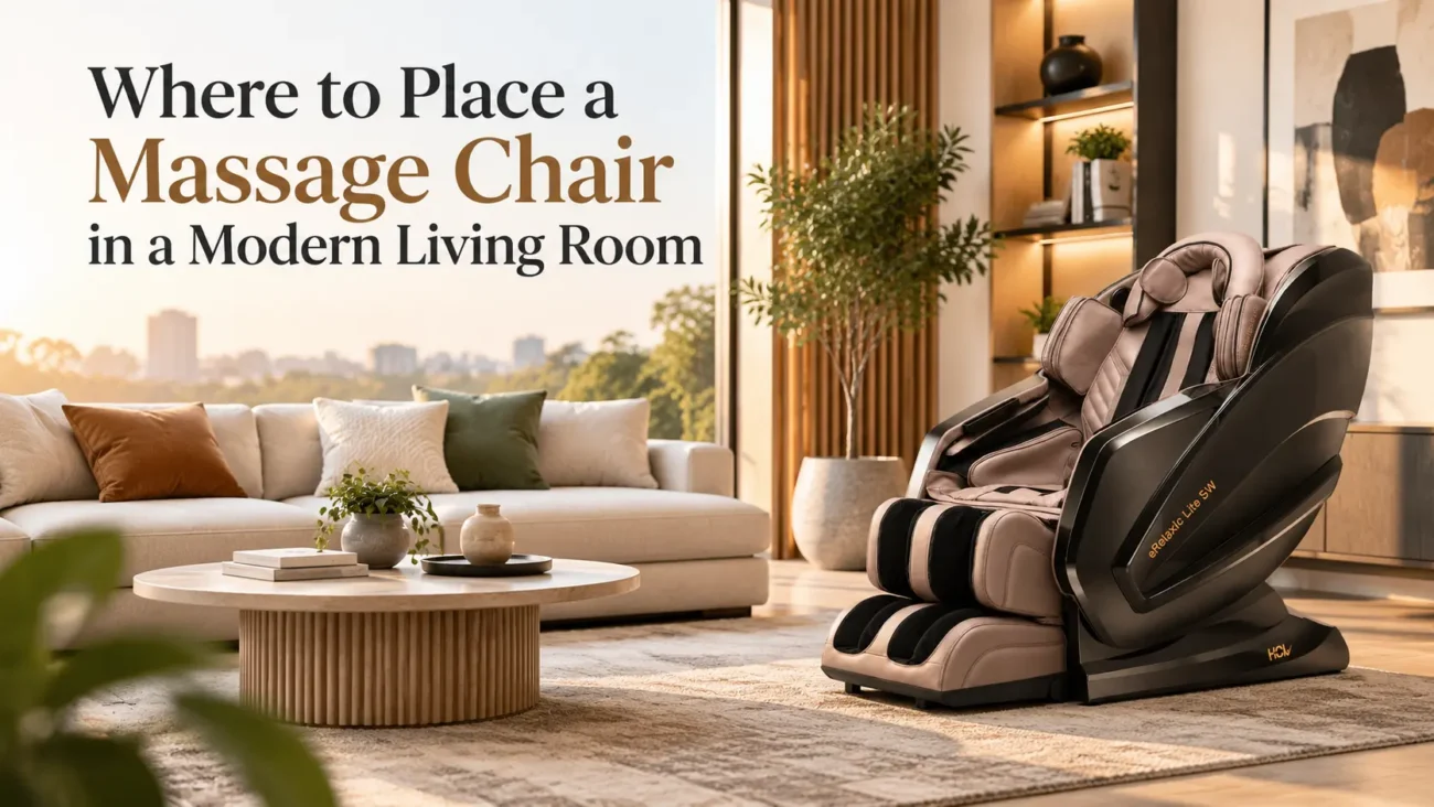
Colour does not work alone. A chair placed in front of a wall of contrasting colour becomes a statement. One placed beside similar tones fades gracefully into the background. Positioning it near a window gives you natural light, but direct sun can fade upholstery over time, so use curtains or sheers where needed.
If the chair is in a bedroom or home spa corner, softer tones and warm lighting reinforce relaxation. In a living room, a slightly bolder colour can help the piece feel integrated with the rest of the seating.
Final Thoughts
The best colour is the one that suits your room, your lighting and the way you live. Neutral tones like black, cream, and grey offer lasting versatility, while browns add warmth and jewel tones add character. Take your time, test samples at home, and think of the chair as part of the room’s overall palette. When colour, material and placement work together, a well-chosen massage chair becomes both a source of comfort and a quiet design feature.